Joga Bonito

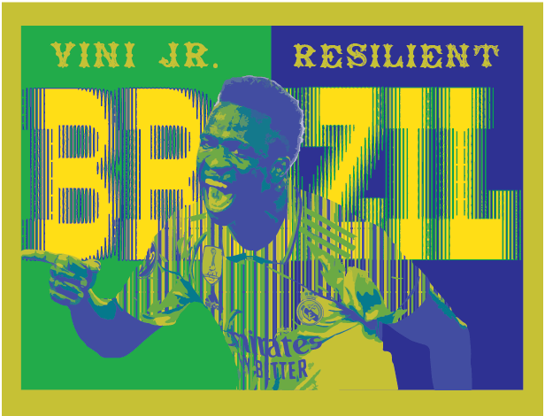
In my Graphic Art class, I completed a project that was focused on making a poster for someone who is an activist in their community. For this project, I chose Vinicius Jr. a soccer player for Spain based team Real Madrid. My artwork was meant to hone in on Vini’s background which is Brazilian and I did this by using their national team’s colors. I also made sure to include Brazil withinside of my art piece. I created my art piece in adobe illustrator and through a long process I eventually ended up with what I have now. Some techniques I used for this project was image tracing which helped a lot when bringing in the picture of Vini. The big idea behind my project is to show how strong Vini is when he stands up to racism. I think the bright colors add a pop of personality to my art work the same that Vini adds such personality to his playstyle. The goal of my artwork was to not only create something inspiring but also meaningful and aesthetic. I think when something is appealing just on first glance the message is more likely to be looked into as it catches peoples attention. My overall thoughts on my artwork is that I really like it and I’m proud of the work I completed. I also am happy that I was able to be open to the ideas my teacher and classmates shared with me.


“The Calcio Spartano football club is much more than a football club, to a lot of people its a way of life.” – Robert Kelly


What is the type of business you designed your logo for? Explain.

The type of business that I designed my logo for is a soccer club. This soccer club will be based within Rome, Italy. 


How does the logo represent your business? Explain.

My logo represents my business because it has that classic soccer feel that most true fans can recognize. On top of this, the stars featured within my logo also signify hypothetical Champions League wins which is something exclusive to soccer. 


Who is the target audience for your business? Explain.

The target audience for my business is soccer fans based all around Italy but mainly within Rome. This is because my business would be based within Rome which is why the logo features ties to important parts of Roman history. 


How does the logo appeal to that target audience? Explain.

My logo will appeal to my target audience, soccer fans, because of its classic feel with a little bit of a more modern pop to it. 


What are you the proudest of in this piece of artwork?  Explain.

Within this piece of artwork, I am most proud of my ability to create a logo that is semi-modern in design while also maintaining that classic badge look that is so well known amongst the big name teams.


What could you have done better? Explain.

I think one thing that I could improve within my logo would be how my text is set up. While working through my logo, I found it really challenging to position and space the text how I wanted resulting in me not being able to get it exactly how I like.

“Take off that suit and what are you?”

  1. What is the subject of your illustration and why did you choose it? Explain.

The subject featured in my Pictogram Poster is Tony Stark and his alter ego Iron Man. I decided to choose this to be my subject for my Pictogram Poster because Iron Man is one of my favorite superheroes and he fits the theme very well. 


  1. What do you like about your art? Explain.

Throughout my piece of art, there are 3 things that I thought, not to toot my own horn, were very cool and likable. First, I really like the “O” in “Iron” being the actual Stark reactor seen in Tony’s chest. Another thing I really like is the font I was able to find and how well it fits the theme of my poster. Finally, I really like Iron Man taking off in the middle of the “M” and “A” of “Man” as I think it’s just a cool little addition. 


  1. What advice would you give another student before they begin the pictogram technique? Explain.

The only piece of advice I would give to another student before they begin the pictogram technique is to choose something they really like to be their subject. This will help them stay motivated throughout their work and allow them to create something they truly like.

“Kindness is more than deeds. Its an attitude, an expression, a touch. Its anything that lifts another person.”

Card 4 Kids


Describe your artwork:

In our graphic art class we were instructed to create cards for kids with positive and uplifting messages featured on them. For starters, these cards are meant to be a nice gift for kids with cancer and to just share love and support with them. My card features a vibrant peacock with a pretty typical background of grass and a sky. Within the sky there are clouds which is where I embedded my positive message.


How did you create your artwork?

I created my card using Adobe Illustrator where by using shapes and lines I was able to create my card from scratch. I also used a reference photo for my peacock so that I could make sure my card looked its best. 


What is the big idea behind your artwork? 

The big idea behind my card is to share a positive message to kids who are suffering with cancer. Although I am unable to do anything to directly help the sickness, I would like to do everything within my power to help these kids feel better in any way. 


What were your goals for this artwork? 

My goal for this project was to take my time and make sure to make mine look as neat as possible. I would hate to create a sloppy card when it goes to such a significant cause. 


What are your overall thoughts of your artwork? 

Overall, I felt as if I did a good job of creating something that not only I could appreciate but also the kids. I liked learning the ropes of Adobe Illustrator because now I can use some of the tactics I learned while doing this project in future projects of mine. 

“Argentina campeonatos del Mundo, Argentina campeonatos del Mundo!”

When I created this composite image, I was directing it towards fans of soccer or even just people who have a general knowledge of soccer. I hope this image captures the message I intended it to which was a significance of the passing of legacies from one legend of Argentina to another. Within the photo, Maradona and Messi are featured and these two players are both legends of the sport and are considered to be all time greats by all with Messi even being seen as the greatest of all time. Throughout Maradona’s international career with Argentina, he won a world cup for them and was labeled as the face of soccer for Argentina. That was until Messi came along, and Argentina had a new face of their soccer team. That is why I choose to use the painting “Creation of Adam” which depicts an angel giving its blessing to Adam. Knowing that, I placed Maradona’s face upon the main angel reaching out to Adam to pass on the blessing, and placed Messi’s face on Adam who is receiving the blessing. This basically depicts Maradona passing on his blessing/legacy to a young Messi. For people who plan to create something like this in the future, I would suggest doing something that you truly like as I had a lot more fun doing something I liked. It allows the creator to have a more free flow of creativity as they are truly connected to message within their work.

“You gon have to ask him, He ain’t even finish the game! Ice up son, Ice up!” – Seb Carlo

Shadows
Oil and Water
Water beads
Reflection

Questions for the Shadows photo:

1. In my opinion, I think the distinct mood of this image is serene but also this kind of sci-fi sort of feel to it. When I look at this image, it reminds me of the city you see in blade runner 2049 as it has this same kind of vibrancy to its colors with a similar darker shadow surrounding it.

2. As I previously mentioned, this photo reminds me of the blade runner 2049 movie and how vibrant the city is. I like how the glass refracts the light in a way that even the shadows are interesting with their own shapes and contributions to the harmony of the photo. This is very similar to the overall look of the city that is featured in the movie which why I like this photo so much.

3. What jumps out to me within this photo is not just the glass but actually the way it refracts the light. I love how in the backdrop of the photo, you see the unique shape the reflection of the glass and color create in the back. I love how it almost reflects the glass perfectly which creates this perfect relationship between these two parts of the picture.

4. This photo makes me feel almost inside of it because I personally love when a city or room has this kind of vibe. It makes me feel a little bit cozy in a sense as I really love how it looks in total.

5. Some advice that I would offer to students that will be doing this project next year is to be patient. When I was taking these photos, it took me a long time to finally find the shot that I liked. In the end, it was all worth it because as you can see, I really love the way each of my photos came out.

“It’s just a job. Grass grows, birds fly, waves pound the sand. I flic people up.” – Seb Carlo

Palatable Portrait taken outside the Oratory Prep cafeteria.
Palatable Portrait taken in op cafeteria outside of class

1. I chose each of the foods selected because I had seen what I wanted to do before I actually did it. For the donut I could see that it would be a really cool photo and knew that I had the idea of making it kind of like glasses. For the cheese steak I liked the way it popped out and knew it would be a good photo.

2. For the lighting in each of my pictures, the sun is what is reflected upon each of subjects. For the donut, I took this during class in the morning, which gave it this very vibrant lighting. For the cheesesteak, this photo was taken near a window on a sunny day but there is also a ceiling light reflected on it. I like how the sun makes everything brighter but the way it reflects on my main subjects makes them pop out.

3. Within both of my pictures, I used composition techniques in order to help the viewer truly appreciate what it is I’m trying to relay. For the donut photo, I used ruled of thirds in order to draw the center point of attention to the food featured in my picture. For the cheesesteak photo I used negative space by removing the background in order to draw more attention to the food.

4. With the color splash technique, I was able to make my food truly pop in each photo which really gets my point across. I really like how with the donut, it makes it look kind of like an eye piece which just makes the photo that much better. The cheese steak looks cool with the fully blacked out background and in front of the black and white subject which makes the photo really appealing and almost appetizing for the viewer.

5. When it came to enhancing my images, I used a wider lens in order to not only capture Henry but also give it a good backdrop that adds detail to the photo. On top of this, for the cheesesteak, I used a filter on phone where as you take the photo it removes the background and makes it black which made my subject pop. Finally, in photoshop, I made both the people in my photos black and white and left the food in color so it would stand out.

6. Some advice I would give future photographers in this class would be to actually plan your subjects out. I would make sure to know what the project is like and to take my time. I would also work with someone you feel comfortable with as it makes it more fun and you are able to create more creative photos.

“You wanna be fast like Isaiah and you wanna shoot like Bird. Rebound like Barkley. Pass like Magic. Be dominant like Shaq. But man, I wanted to be like, Seb.” – Allen Iverson

Man Made Line
Natural Line
Geometric Shape
Organic Shape
Black and White Finish
Feels 3D
Small Depth of Field (Blurry Background)
Close Up
Green Focal Point
Texture found within a bench 

1. Within my work, strengths and weaknesses are both present in their respective aspects. A strength that I thought I truly displayed throughout my work was creativity and attention to detail. For example, I think in my black and white finish photo and my geometric shape I took a lot more time to look into minute details which ended up bringing the whole idea of the photo together.

2. In future projects I might refine my approach by taking more time in experimenting with photoshop in order to find what truly assencuates the idea I have in mind. With Mrs.Otterbein’s help I was able to do this with my blurred background photo which is one of my favorites. I think if I took the time to do this within all of my projects they will turn out even better then they already do.

3. For my photo of the Oratory field while a gym class is in session with a black and white finish, I was hoping to convey the feeling of nostalgia. When you look at really old photos of almost anything, the picture has this beige-ish tint to it. I kept this in mind and mixed within just a normal black and white finish to give it that extra umph of a nostalgic feeling.

4. An element I would like to further explore would be blurring along with shading. I feel the combination of these two truly help annunciate space within a photograph. I think through correct guidance a person can transform a normal snapshot into a piece of fine art through blurring and shading with the understanding of space.

5. In my future projects I would like to try and experiment with blurring things more. I felt like I struggled with setting up my blurry background but with the help of Mrs.Otterbein I eventually got the hang of it. I found interest in other photos that took advantage of blurring and would like to try and imitate the style of those pictures.